A DOQQ or Digital Orthographic Quarter-Quad is simply a digitized aerial photo map that has been rectified of any errors so that they show their true geographic location. The DOQQ above was one taken of a heavily populated section of London.
Tuesday, November 27, 2012
Univariate Choropleth Map
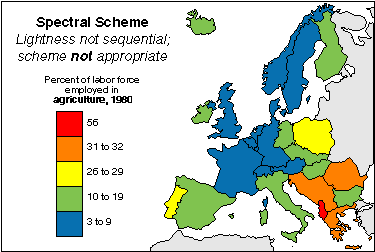
A univariate choropleth map is a choropleth map that only displays one variable. The univariate map above shows the percent of the labor force in different countries in Europe that is employed in agriculture. This is the only theme or focus of the map which classifies it as a univariate choropleth.
Nominal Area Choropleth Map
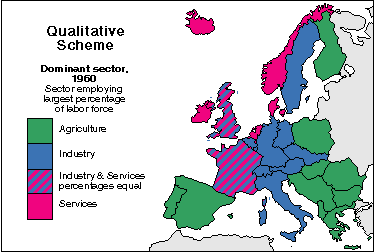
A nominal area choropleth map shows non-quantitative data. Since the data that is being mapped out is nominal it can not be put in any sort of numerical order so the colors chosen to represent the data are not different shades of the same color, as in most choropleth maps, but rather colors that are clearly distinct from each other. The map above shows the sectors that employ the largest percent of the labor force of areas in Europe.
Cartographic Animation
http://www.katrina.noaa.gov/images/katrina-08-28-2005.jpg
Cartographic animation is used by meteorologists to portray weather patterns in an informative and visual way. This type of map layers a three dimensional layer of weather on to of a two dimensional map and the weather patterns are usually in motion.
Classed Choropleth map
http://my.ilstu.edu/~jrcarter/Geo204/Choro/CIESIN-2003/US-map-4quartile-purple.jpg
A classed choropleth map is one that is directed towards determining the classification of a choropleth map. Essentially, this means figuring out the different classes of what is being measured in the map, and how to shade the map to display these classifications. There is also a legend to help the reader better understand these classifications.
Continuously Variable Proportional Circle Map
http://geographyfieldwork.com/Choropleth2.gif
A continuously variable circle map is very similar to a normal circle map, except for the fact that in addition to the variable represented by the actual circle, another variable is represented inside of each of the circles. In this map, the bigger circles represent larger populations, and inside the circle, the variation of the population is represented in the form of a pie chart.
Monday, November 26, 2012
Similarity Matrix
http://www.springerimages.com/img/Images/BMC/MEDIUM_1471-2105-10-S11-S5-4.jpg
A similarity matrix simply shows the similarity between data values. It is for this reason that a similarity matrix and a correlation matrix are different. Data values that are more similar receive higher scores, and data values less similar receive lower scores.
Correlation Matrix
http://yin.che.wisc.edu/images/ProteinMatrix.jpg
Simply put, a correlation matrix is a graph that shows the correlation, and strength of correlation between all possible pairs of data in a particular data set. Typically the matrix is shown as above but there are also a couple of other ways it can be represented.
Windrose
http://www.vistadatavision.com/uploads/images/Gallery/Wind_Rose_Distrubution/wind_rose_vector_1.png
The wind rose is a graphical tool used by meteorologists. The graph generally represents data in an easy to understand way and describes which direction wind normally comes from at a certain location. The data is represented in percentages.
Lorenz Curve
http://www.unc.edu/depts/econ/byrns_web/Art/Glossary/LorenzCurve.jpg
A lorenz curve is basically a graph of households and their total income. These data sets are graphed in cumulative percentages.
Standardized Choropleth Map
https://www.e-education.psu.edu/files/geog484/image/L06cg_fig10.gif
The main difference between standardized choropleth maps and normal choropleth maps is that the data in standardized maps, the data is areally averaged and is standardized to some unit. The map above is standardized to persons per square mile, instead of just the number of people living in these states.
Thursday, November 22, 2012
Parallel Coordinate Graph
http://andrewgelman.com/movabletype/mlm/mdg1.png
Parallel coordinate graphs can be used to show data in various types of ways. This relatively new and complex map type focuses on the width of the plotted lines for dimensional data sets.
Triangular Plot
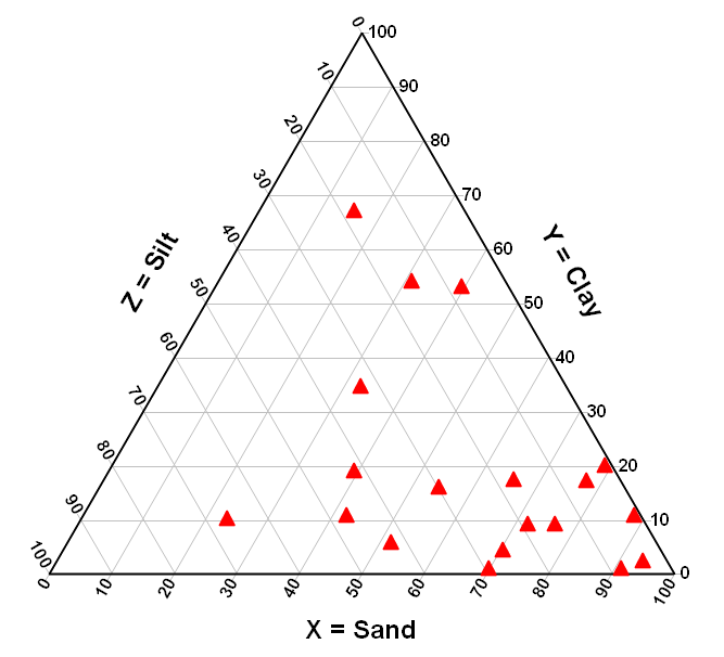
A triangular plot is a complex graph that compares 3 variables in one graph. The ratios of these variables are placed on the three corners of an equilateral triangle and the tree variable quantities sum up in to one constant value.
Climograph
DEM
http://nsidc.org/data/docs/daac/nsidc0304_0305_glas_dems/GLAS_Antarctic_DEM.jpg
DEM, or digital elevation model, is a computer based model that can be either 2D or 3D model of a certain terrain. It is used on things like the terrain of the Earth, the moon, or asteroids to better understand the surface of these things. The DEM above is based on the antarctic and shows projected elevation in that region.
Isoline Maps
http://indiemaps.com/images/isolineFinished.png
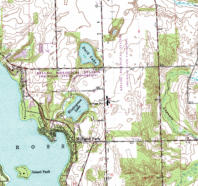
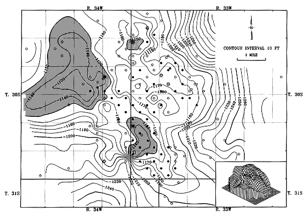
An isoline map is simply one with contour lines running through it. These contour lines connect places with similar data values pertaining to the purpose of the map being displayed. There are many types of isoline maps that all have different purposes. Some examples are isobars (pressure), isotachs (wind speed), and isohyets (rainfall).
Black and While Aerial Photos
http://www.jaha.org/edu/flood/rebuild/img/panoramas/550w/JT_aerial-1920s-550.jpg
This mapping type is a form of remote sensing and uses black and white film to map out a particular area using images taken from the air. It is useful for mapping out surface structures and landforms.
Infrared Aerial Photo
http://ecosystems.mbl.edu/pie/data/MAP/irparker.jpg
Infrared photography is a wonderful tool that can be used for many different things. Infrared can detect things in an aerial photograph that might not be easy to determine with the naked eye. It can do things like help track changes in the environment and can also detect things like insect infested farmlands and toxic chemicals in the environment.
Thematic Maps
Thematic maps are a very broad type of map, and most geographic map types can also be classified as thematic maps. A thematic map is pretty self-explanatory. It is a map that has a certain theme, whether it be political party disbursement like the one shown above, or physical, agricultural, educationally themed maps.
Mental Map
https://blogger.googleusercontent.com/img/b/R29vZ2xl/AVvXsEg31s7OwNRkQDTW_oaoNvHSRp0NuKOYQV8de8ngCkLJV8My5UW_Fy8qwKl8CKcNweW-KjurmSKB31UX6B6AJ_nB0A6N1YMy2cAP1QMH9ewCEqHzsctIpIxFl7WKvrCQUjvk5fkuUKgn70TQ/s1600/mental_map.gif
Mental mapping is a unique type of mapping in the sense that many times, physical or digital maps are not created. Mental maps are purely created in one's mind, and they are a basis of the "map-maker's" point-of-view towards the world around them.
Cadastral Map
http://www.spaceage.co.in/images/cadastral-surveys-img1.jpg
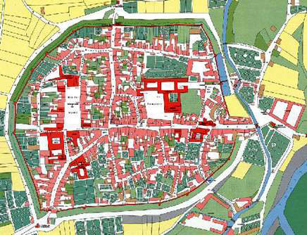
Cadastral maps are survey systems which categorize land and property through many categories. These categories include land ownership, dimensions of the area, and precise location of the land.
Proportional Circle Map
In a proportional circle map, data sets are represented by circles that vary in size. Larger circles represent larger data values and vice versa. In the map above, the reader can easily see which states have the largest farm sizes by simply seeing which states have the largest circles.
DLG
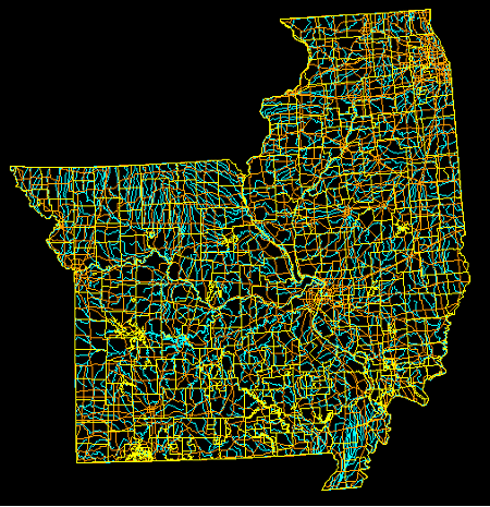
DLGs, or digital line graphs, are digital systems that, alone, are not maps. They work with data sets and project the data onto different types of maps in the form of colored lines or shading. The data is displayed on different scales.
DRG
http://lter.kbs.msu.edu/wp-content/uploads/2012/06/Topographic-map-DRG.jpg
DRGs, or digital raster graphs, are paper maps that have been scanned onto a computer to be projected in UTM format. These maps get georeferenced to the surface of the Earth but are rarely used in actual GIS.
Propaganda Map
https://blogger.googleusercontent.com/img/b/R29vZ2xl/AVvXsEiKWODSl7AQ0y5CurG542FTHz4emAlrlMmw5FtqLKaos5W1S4gcISzP-8vWbxRV9mpGBs3Jc0s2wl4nAJBNhs4DfoIhQ1CJjQfd-WelMAzI90biArt2LF9fRp-TVONbh6azBraF20DHcnQ/s1600/Propaganda+Map.jpg
A propaganda map is one usually used as an advertisement to push a specific idea unto the reader. There are many different examples of this type of map, but they all are similar to the example shown above. Shapes are distorted and places are renamed to help persuade the reader to share the same ideals as the artist of the map.
PLSS Maps
PLSS is a map system that is used for public land distribution throughout the US, with the exception of a few states not included in the system. It divides land in equal-sized squares of land. The use of this system has made land distribution much simpler for the government to keep track of in participating states.
Star Plot
http://www.nehu.ac.in/iqac/img/radar-chart.jpg
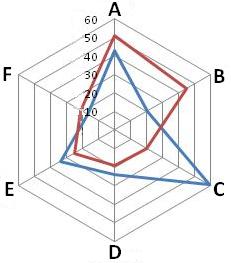
Star plots are used for displaying information about relative values that revolve around a single data value. They are relatively complex to understand, with no prior knowledge on how to read them, but they are unique in the data they represent.
Stem and Leaf Plot
http://www.mathsisfun.com/data/images/stem-leaf-plot.gif
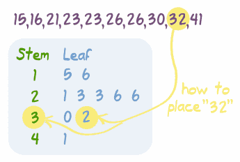
A stem and leaf plot is similar to a histogram when using data sets, but provides more detailed information about each specific value. Stem and leaf plots are usually used when the data set is relatively large, and makes it easy to summarize the data and place it in an easy way for the reader to comprehend.
Wednesday, November 21, 2012
Box Plot
http://ellerbruch.nmu.edu/cs255/jnord/three.gif
A box plot is a convenient graph to use when dealing with large data sets. It is a summary of a data set, that shows the lowest extreme, the highest extreme, the middle 50%, and the 25 and 75 percentiles of a data set. It is also sometimes called a box and whiskers plot.
Histogram
http://www.netmba.com/images/statistics/histogram/histogram.gif
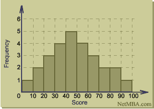
A histogram is a bar graph that shows one data set with one variable. It is shown on a graph with two axes, and is possible one of the most popular graphs used to display information when it comes to graphs with one variable.
Bivariate Choropleth
http://www.politicalruminations.com/images/charts-graphs/karl-rove-electoral-map.png
A bivariate map shows two sets of data on one map. The data will often be differentiated using different shading or colors. This map shows a data set of projected voters based on the citizens' political preferences. It also shows how the electoral college votes are split up by states.
Scatterplot
http://davidmlane.com/hyperstat/pictures/strength.gif
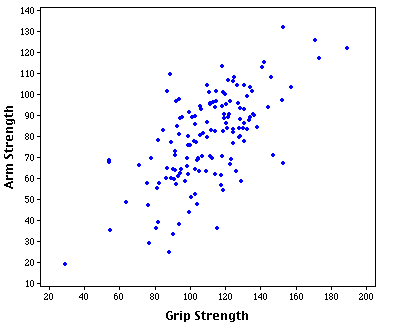
A scatterplot is a map that shows the relationship of two variable quantities, and does so plotting on two axis that meet at a right angle. These graphs show correlation, but can not provide cause and effect. The example above is a scatter plot of grip strength vs. arm strength, but the two do not necessarily base off of each other. There is a positive trend, but there are many outliers and extremities.
Isopleth
http://www.ij-healthgeographics.com/content/figures/1476-072X-3-18-7.jpg
An isopleth is a contour line on a map that connects regions that share a ratio of a particular geographical or meteorological phenomena. Just like all maps that use contour lines, the lines connect areas that are similar in whatever the map is projecting.
Isopachs
http://www.kgs.ku.edu/Publications/Oil/gifs/fig10_2.gif
Isopachs are contour lines that display stratified thickness of rock layers on topographical maps.
Isohyets
https://blogger.googleusercontent.com/img/b/R29vZ2xl/AVvXsEgi12ZLFxjjLudscERuSCGdawAOZTHAHb_P5qHTHxe5s68C5ijGZXQpZeOpuKR1dxFWClMO4b5oOQ1QisSCB_zBZwE57GiOp3A7IkIpsZBuQqCKUSpMJC52eWtgnBf8QSlEUQWI3J786Mo/s1600/20.gif
Isohyets are maps that use contour lines to connect regions and areas that share similar annual rates of precipitation.
Isotach
http://cdn2-b.examiner.com/sites/default/files/styles/image_full_width_scaled/hash/40/03/400354d5f8096674a100a6b48c5d6be5.png
Isotachs are maps that use contour lines, but instead of showing atmospheric pressure like isobars, these lines represent wind speeds. The contour lines that pass through each region connect areas with similar wind speeds and patterns.
Isobar
http://facweb.bhc.edu/academics/science/harwoodr/geol101/labs/wind/Images%5CIsobarMap3.gif
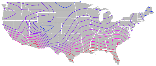
An isobar map is a map that displays atmospheric pressure. The contour lines connect areas on a map that have similar atmospheric pressures and some, like the map shown here, show the areas of high and low pressure.
Doppler Radar
http://www.noaanews.noaa.gov/stories/images/claudette-radar071503-1536z2.jpg
Radar is a detection system that uses radio waves to create images like a Lidar system uses light. Doppler radars send out microwaves to create these images and use the doppler effect to assess what is going at long distances.
Cartogram
http://www.ncgia.ucsb.edu/projects/Cartogram_Central/images/cartogram2000.gif
A cartogram is a map that shows geographical areas that have been distorted to show their relevance as pertains to the category of the map.
Bilateral Graph
A bilateral graph is a graph that shows two different sets of information in the same graph. This graph shows trade between Canada and Brazil in the years of 2005-2009. these graphs aim to display information in a simple, easy to read way.
Hypsometric Map
https://blogger.googleusercontent.com/img/b/R29vZ2xl/AVvXsEiqfEGSdJSpdbC_TXvF5ROPBlEsB-yzuje3v6YurW7pEQFc65TYZgenikAM4Yp4I7CXkErvn-24gubCjMT9yexOt-LSCV1XTjZYHj3qk3OftwGArUHgh7qrz5cKs8QjPOcTP4tJIAhYNnBt/s1600/hypsometric.jpg
A hypsometric map is a map that shows elevation and shows the differences in elevation by using contour lines or shading. This particular map uses shading to show the differences in elevation on the continent of Africa.
Choropleth Map
http://upload.wikimedia.org/wikipedia/en/2/27/Choropleth.gif
A choropleth map is one that shows data across designated regions and uses coloring or shading to show the differences in these regions. This map in particular shows the differences in water use throughout the states in the United States.
LIDAR
http://vulcan.wr.usgs.gov/Volcanoes/MSH/Eruption04/Monitoring/ImagesGraphics/LIDAR_crater_dome_sept03_and_nov04_animated.gif
LiDAR stands for Light Detection and Ranging, and is very similar to Radar, but uses shorter wavelengths to image surfaces that are not as reflective. This LiDAR shows the crater of a volcano and is useful for studying the things like this in geology and meteorology.
Flow Map
http://www.angelfire.com/sc2/rvcscience/ph.gif
The flow map shown here describes the process undergone by plants called photosynthesis. It is a very simple flow chart meant to make it very easy to understand the process it is explaining. Flow maps are very effective in teaching things that have steps, because it is easy to break down those steps and show each step individually. The pattern of this map is to show the process of photosynthesis, step by step.
Dot Distribution Map
http://www.census.gov/geo/www/maps/2010_census_nighttime_map/imgs/2010_Nighttime_PopDist_Thumbnail.jpg
This map is a dot density map, showing the population distribution of the United States and Puerto Rico in 2010. The map is geared towards showing where most people reside in this country. This information is good to know for many reasons, such as in politics. A presidential candidate can look at a map like this, and learn where to focus their campaigning to reach the most people.
Topographic Map
http://geology.com/state-map/maps/florida-state-map.gif
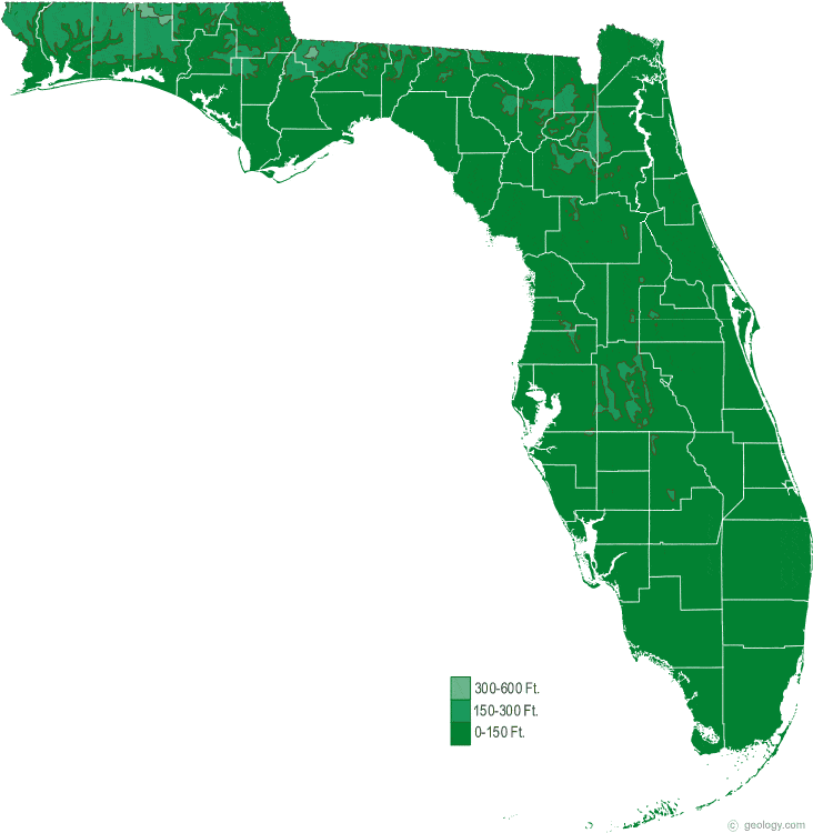
The map being displayed is a topographical map of the state of Florida. The map shows the different elevation levels throughout the state. It shows the reader of the map how flat the state is, with only a few areas elevated above sea level.
Planimetric Map
This is a planimetric map of the campus of Florida State University. The map is a basic rundown of all of the big or important buildings all around campus, with abbreviations of building names on top of their respective buildings. The pattern of this map is to be informative to viewers who are unfamiliar to the locations of the buildings around campus.
Subscribe to:
Posts (Atom)