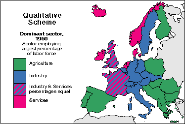
A nominal area choropleth map shows non-quantitative data. Since the data that is being mapped out is nominal it can not be put in any sort of numerical order so the colors chosen to represent the data are not different shades of the same color, as in most choropleth maps, but rather colors that are clearly distinct from each other. The map above shows the sectors that employ the largest percent of the labor force of areas in Europe.
No comments:
Post a Comment